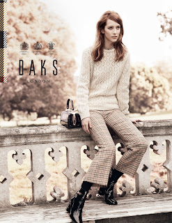
Here's the latest Daks campaign I art directed back in May. If you are a regular reader of this blog you may recall a post about where it was shot from around that time. If not, go and look! Photography Josh Olins, Styling Cathy Kasterine, Hair Shon, Make Up Sally Branka and the models, Alana Zimmer and Vincent Lecrocq.
Tuesday, 20 September 2011
Friday, 9 September 2011
Favourite Football Kits Ever #6 - France 1982
The default 'favourite' French kit is undoubtedly the one in which they won the 1984 European Championship in (blue with a single thick red and three thinner white horizontal stripes across the chest). I personally prefer this one, with its subtle tricolore stripes that follow through the shirts to the shorts. This image shows the Bordeaux midfielder Alain Giresse celebrating giving France a 3-1 lead against W. Germany in the 1982 semi-final. Only 22 minutes remained of extra-time, and still the French contrived to lose on penalties. As an Englishman, I understand how this works. My memory of watching this game as a child with my father is vivid, and the disillusion of how unjust the game can be stays with me (I am an Ipswich fan, so I have carried this burden in other ways). It remains, however, one of the greatest games I have ever seen, as the French captain Michel Platini said; 'That was my most beautiful game. What happened in those two hours
encapsulated all the sentiments of life itself. No film or play could
ever recapture so many contradictions and emotions. It was complete. So
strong. It was fabulous.'
Thursday, 8 September 2011
Favourite Football Kits Ever #4 & #5 - Ipswich Town & Liverpool 1980
This set of images shows Ipswich and Liverpool in action in the 1980-81 season, both at Anfield and Portman Road, when both teams were on a fairly even footing (Ipswich would win the UEFA Cup that season and Liverpool the European Cup). The photography here is very much of that time, I find it far more inspiring than what we see today in this genre. You can just feel that it is film, it's not unrealistically sharp and the colours are naturally saturated from the type used and the printing process. It's so evocative, just red vs blue. This is helped, I feel, by the vivid simplicity of the kits, unadorned as they are by sponsor names, player names and ludicrous weaves in the fabric. I find the composition of the images and the very shallow depth of field gives them a very painterly quality too. Phil Neal looks a bit tubby as well, which you wouldn't get away with today.
Subscribe to:
Comments (Atom)


